To get to the report's page:
1. From the 'Homepage', go to 'OPERATIONS'.
2. Click on 'REPORTS'.
|
Date Range Filter: Enter a custom date range or choose from preset filters such as ‘TODAY’, ‘LAST WEEK’, ‘THIS WEEK’, ‘LAST MONTH’, and ‘THIS MONTH.’ This helps in viewing data for a specific period.  |
|
Key Metrics: The dashboard displays three key metrics in colored rectangular sections:
|
|
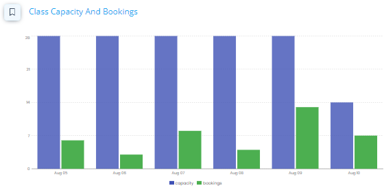
Client Capacity and Bookings: This bar chart provides a visual representation of 'Total Capacity' and 'Bookings', each represented by horizontal bars in different colors.
|
|
Facility Status: This section provides a quick overview of the total rooms and occupied rooms in the facility, represented by circular icons on different colors.
|
|
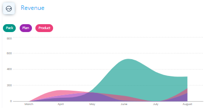
Revenue: The graph illustrates the revenue trends for packs, plans, and products, based on the selected date range.
Hover your mouse over the dates to see the details. |
|
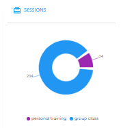
Sessions: The pie chart compares the types of booked sessions or classes over a specified period, with the displayed numbers varying based on the selected date range.
|
|
Note: the displayed numbers varying based on the selected date range and clicking each tile will show a table. |
|
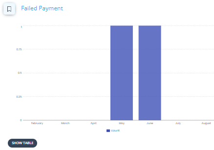
Failed Payment: The graph illustrates the trend of failed payments over a specific period, with the displayed numbers varying depending on the selected date range. |
|
|
|
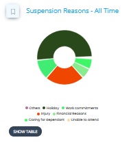
Suspension Reasons - All Time: This graph represents reasons for suspension over the whole period. To view details, hover your mouse over each section of the pie chart. |
|
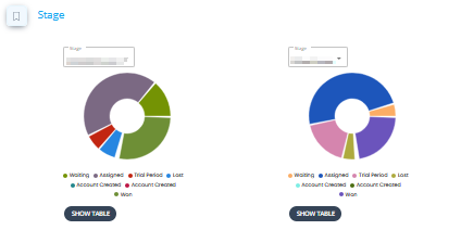
Stage: |



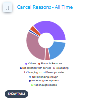 Cancel Reasons - All Time: This graph represents reasons for cancellations over the whole period. To view details, hover your mouse over each section of the pie chart.